I am a small graphic design studio situated in Mt Eden that caters for the small to medium sized businesses across the country.
One of the great things about working from my studio at home (apart from not contributing to the traffic problems in our CBD) is I am able to work nights and weekends ensuring last minute design work is always delivered on time, with no stress attached.
As an artist I bring to my graphic design a strong sense of colour, composition and form, and will often add original features like my paintings to your print work ensuring that your advertising stands out from the crowd.
I strongly believe that clear, strong design is key to promoting your business and deliver this without gimmicks that are here today, gone tomorrow.
If you would like to get in touch to discuss design work, please contact me on tel: 027 274 0986 or email me at: [email protected]
Scroll down to view a small selection of design work
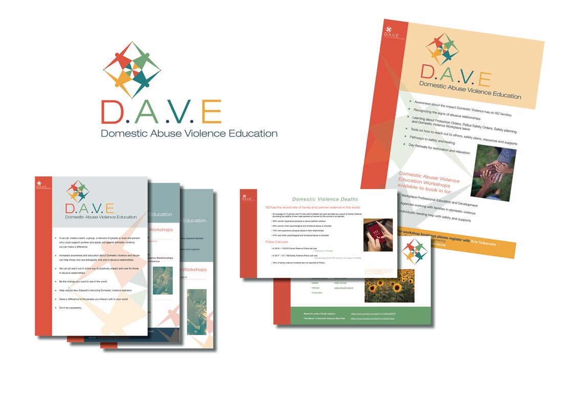
D.A.V.E - Domestic Abuse Violence Education
D.A.V.E - ( Domestic Abuse Violence Education ) were looking for branding that was warm, uplifting and welcoming for their advertising and workshop packages. We went for colours that weren't intimidating or confronting and a logo that promoted inclusiveness.
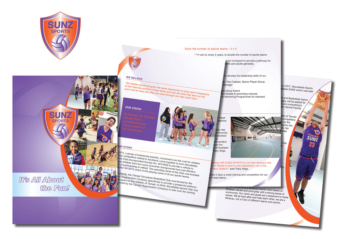
SUNZ Sports
SUNZ Sports under new management wanted to update their brand. Keeping the purple which was a favourite, I intensified the purple and also added a bright orange for punch. I re-designed the logo adding a tag line and then did their brochures and stationery.
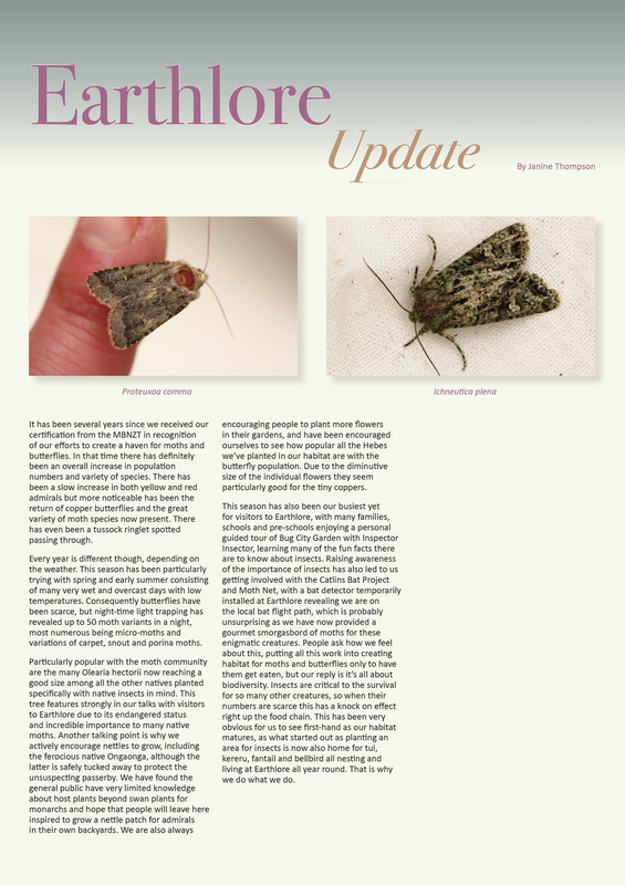
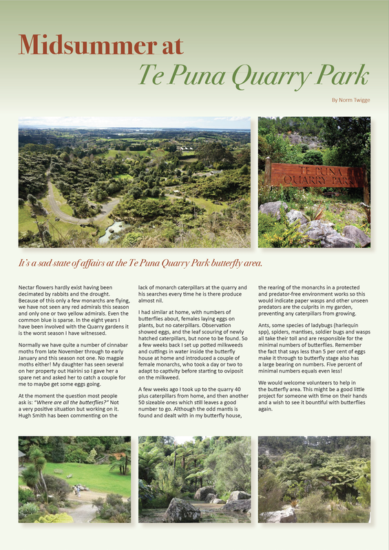
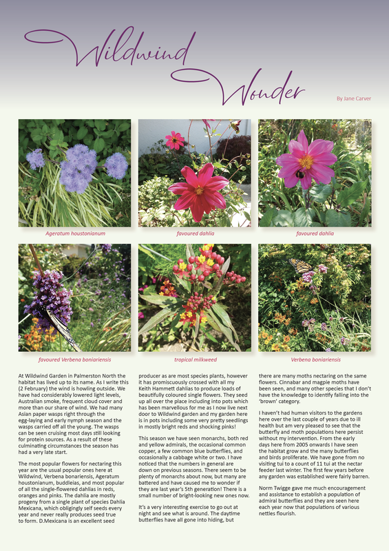
Butterflies and Moths of New Zealand
I was asked to re-design a 'not for profit' magazine - Butterflies and Moths of New Zealand. This was a lovely publication to work on with beautiful photography. It was a pleasure to be able to help out this organisation as they do so much work around our native butterflies and moths.
Freelance Law
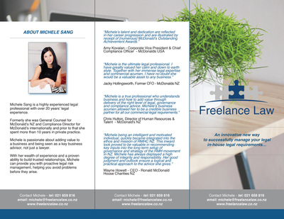
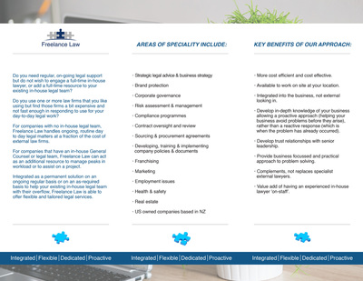
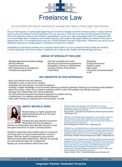
Michele Sang from Freelance Law contacted me as she needed branding and full stationery designed for her new business she was launching.
After designing her logo I set about designing promotional brochures, stationery and business cards, and her all important website.
Michele wanted a no frills, straight to the point look for her business and we accomplished this through minimal features, clear fonts and a subdued colour palette.
After designing her logo I set about designing promotional brochures, stationery and business cards, and her all important website.
Michele wanted a no frills, straight to the point look for her business and we accomplished this through minimal features, clear fonts and a subdued colour palette.
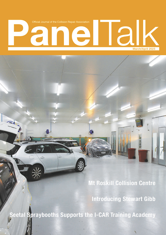
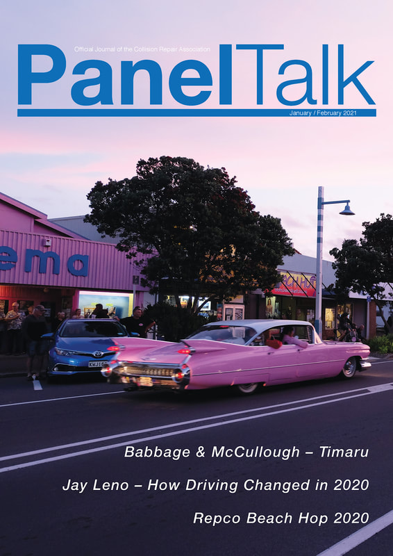
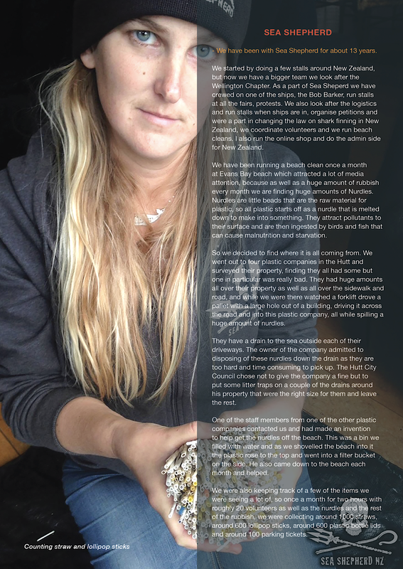
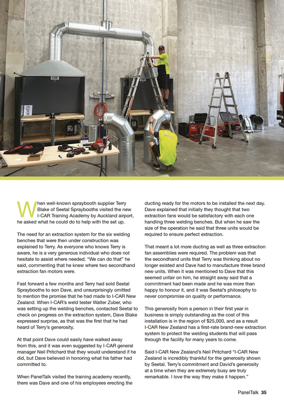
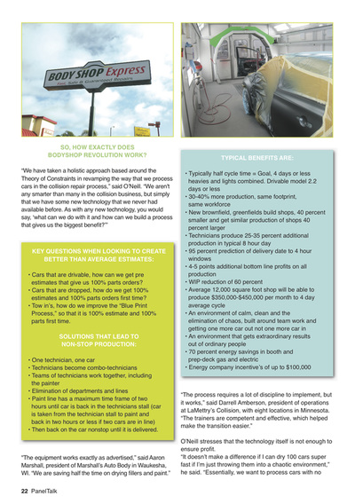
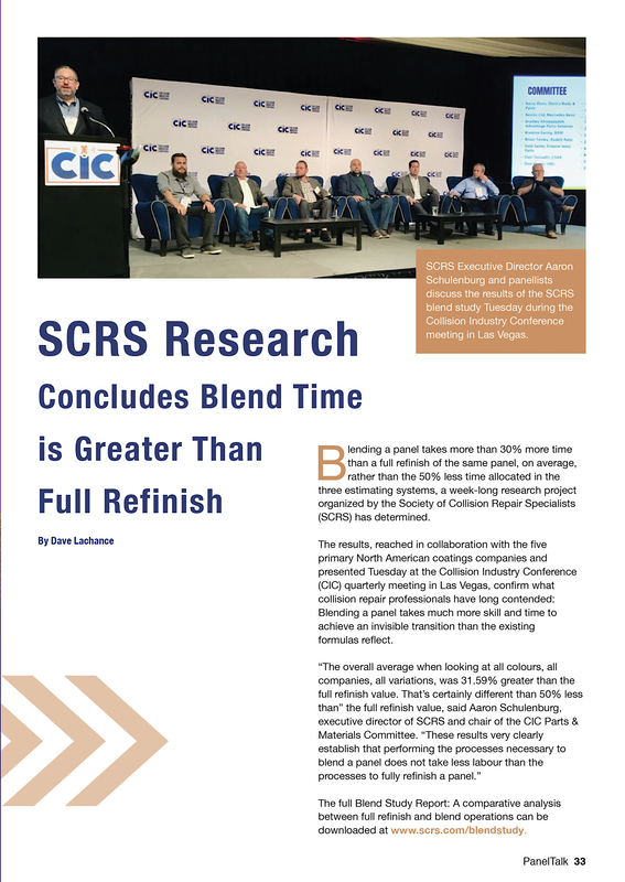
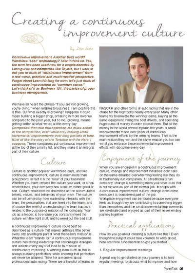
PanelTalk magazine
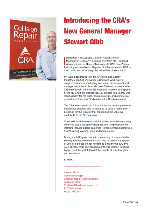
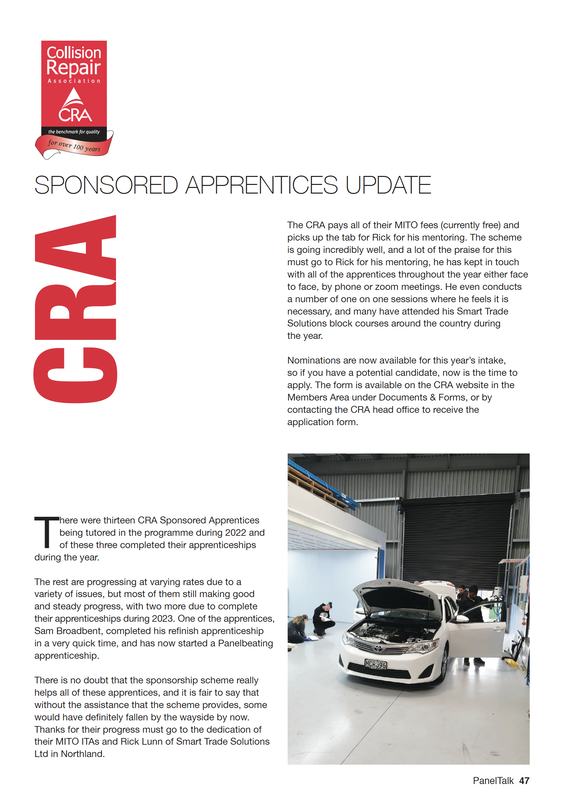
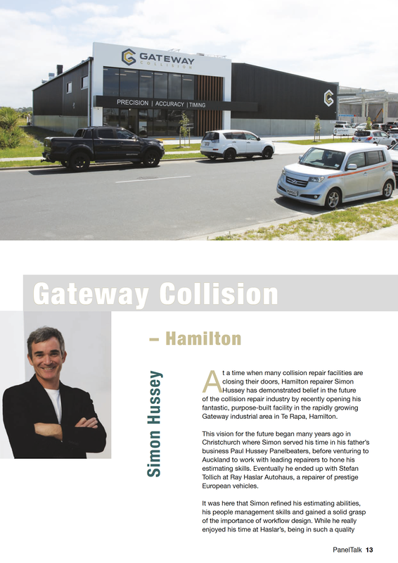
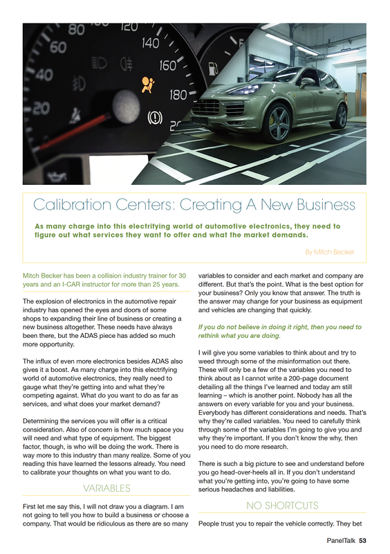
PanelTalk is a bi-monthly industry related magazine under the umbrella of the New Zealand Collision Repair Association - CRA
This magazine is my baby and I have full control from art direction and design through to print.
As this publication is read by a wide range of people in the industry it is important that it's design and 'feel' is all-encompassing. Not too wacky for the older readers, not too formal for it's younger readers. We have a strong international following of this magazine due to our online presence.
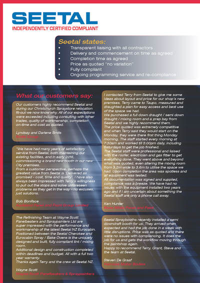
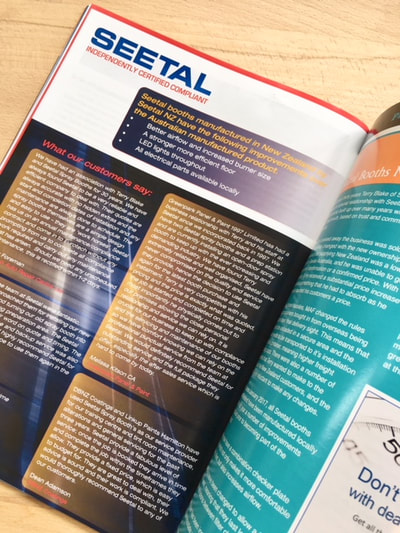
Seetal NZ
SEETAL NZ wanted advertorial for a magazine that was strong, powerful and eye-catching. I designed two full page ads that delivered the information in a clear and concise way while capturing their request for design through the use of a dark colour palette and restrained layout.
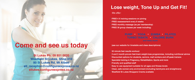
Configure Express Gym for Women
Configure Express Gym needed ongoing flyers, banners and leaflets designed promoting their monthly specials.
They wanted design that was powerful enough to stand out and be eye catching in busy malls while still retaining the Configure brand colours and guidelines.
They wanted design that was powerful enough to stand out and be eye catching in busy malls while still retaining the Configure brand colours and guidelines.
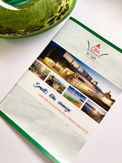
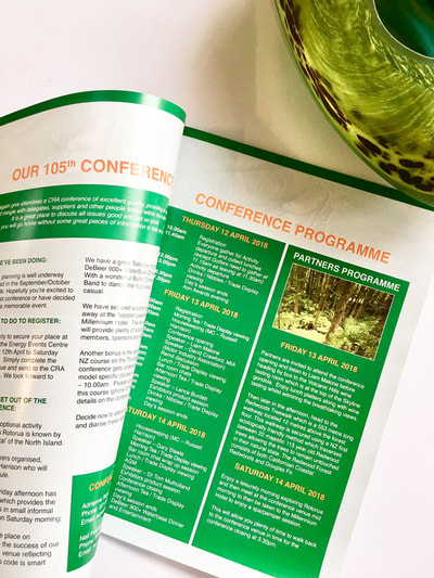
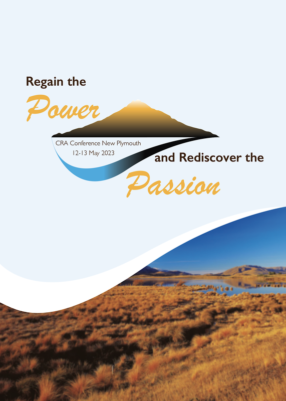
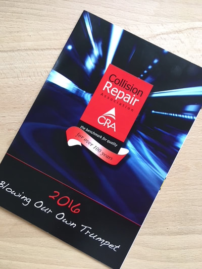
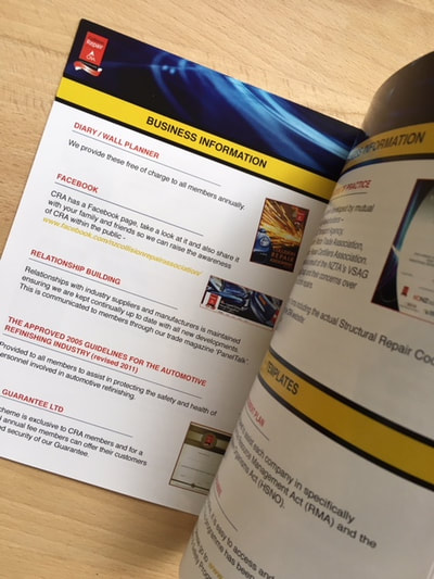
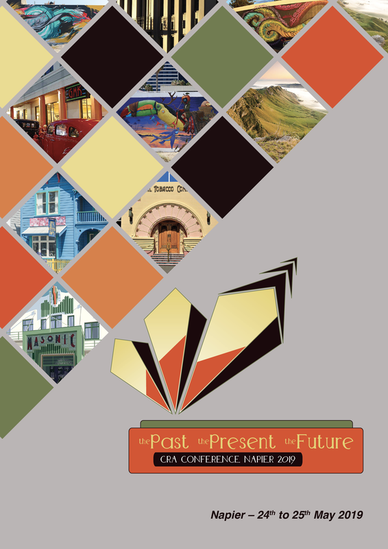
CRA - Collision Repair Association New Zealand
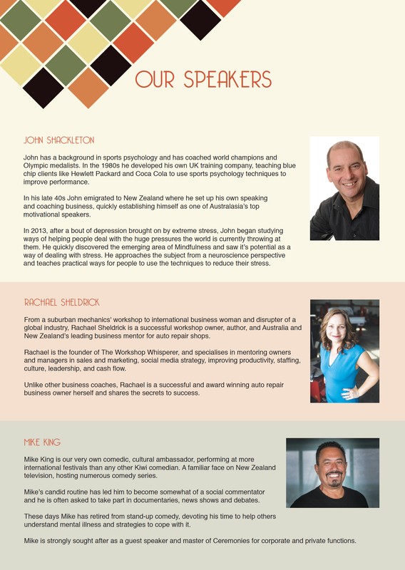
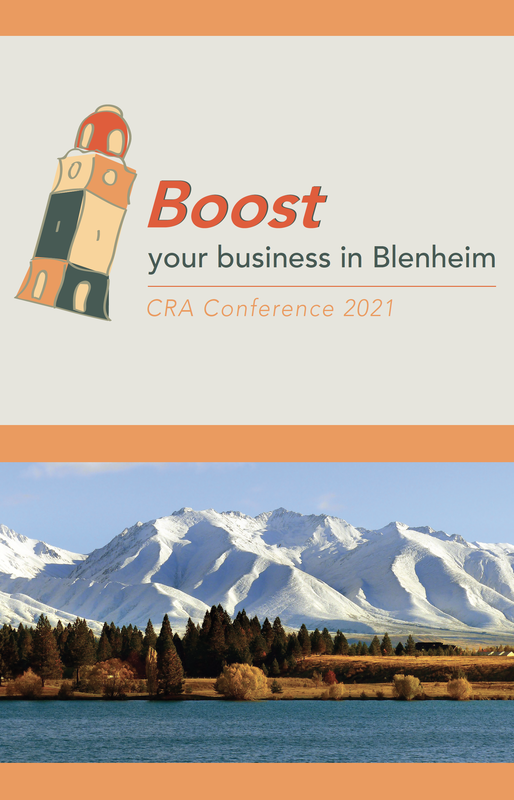
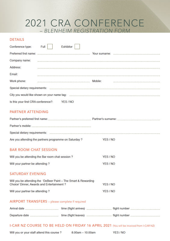
CRA is New Zealand's leading collision repair organisation. I design on-going powerpoints for their roadshows, certificates, flyers, banners, brochures.
Anything they need, I deliver to them.
I also look after their Facebook page updating relevant information, highlighting events and members achievements from around the country, and posting the all important weekly funnies!
Anything they need, I deliver to them.
I also look after their Facebook page updating relevant information, highlighting events and members achievements from around the country, and posting the all important weekly funnies!
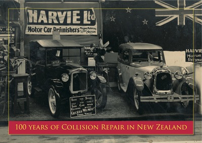
CRA - 100 Years of Collision Repair in New Zealand book - cover and select pages
2013 marked the celebration of 100 years of CRA.
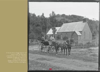
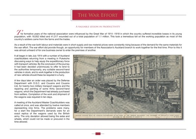
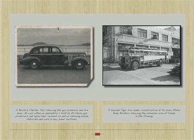
I designed and produced for them a stunning 76 page bound coffee table book highlighting the last 100 years of motor industry in New Zealand.
This book was a delight to design as the old photos were so interesting and were the interviews from the families of prominent people from the motor industry.
It is a gem and something I am very proud to have been a part of.
I-CAR New Zealand
I-CAR New Zealand is an organisation that falls under the CRA umbrella and takes care of all things technical in the motoring industry.
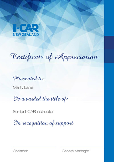
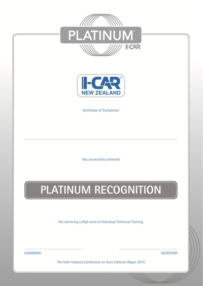
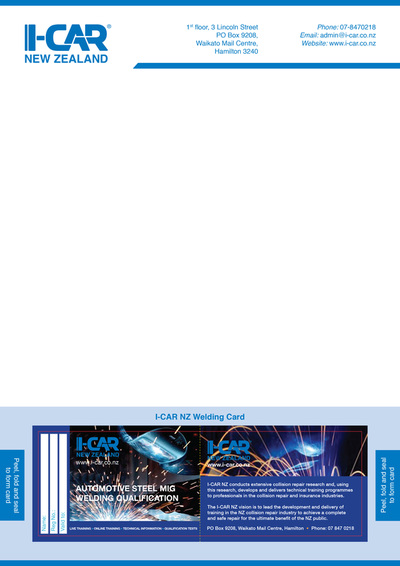
I-CAR facilitates training and for it's members and so much of my work for I-CAR is around advertising upcoming workshops, roadshows and certificates of achievement for it's members.
As with CRA, I look after I-CAR's Facebook page updating weekly news and information for it's readers.
I-CAR facilitates training and for it's members and so much of my work for I-CAR is around advertising upcoming workshops, roadshows and certificates of achievement for it's members.
As with CRA, I look after I-CAR's Facebook page updating weekly news and information for it's readers.
Art Bureau Gallery - exhibition invites
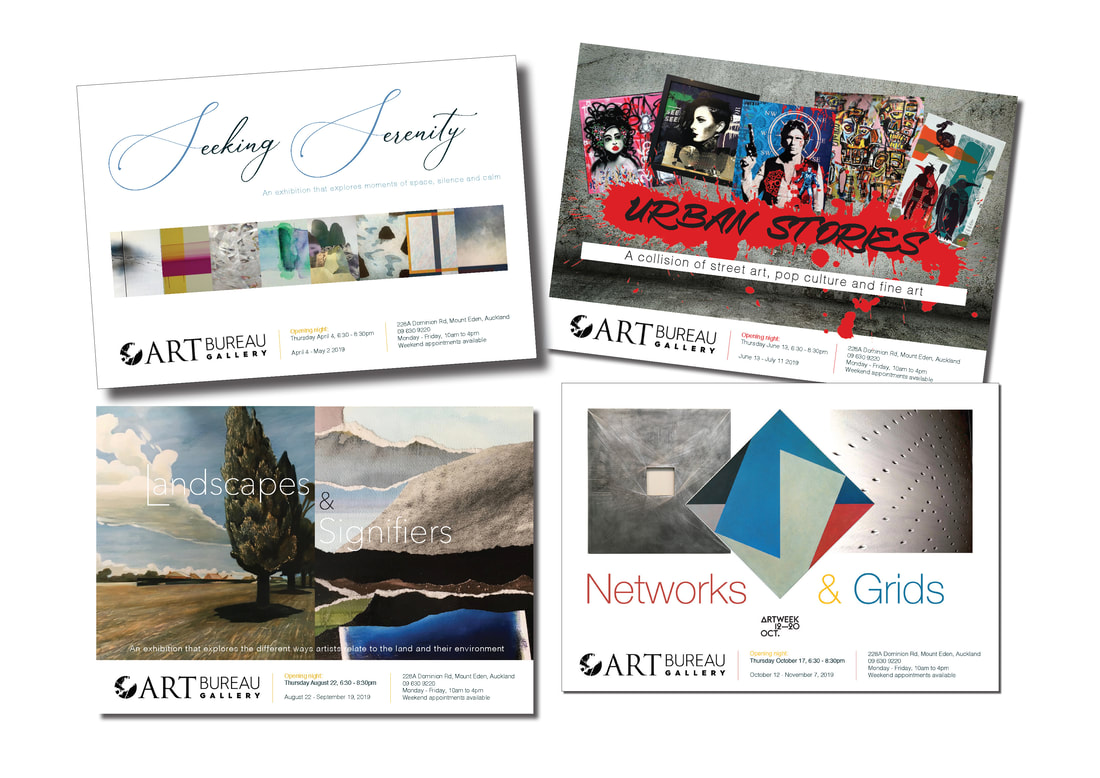
Art Bureau Gallery needed a series of exhibition invitations designed for their upcoming shows. These invitations needed to showcase the various artists represented in each exhibition and illustrate the different concepts behind the curating of each exhibition.
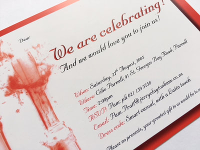
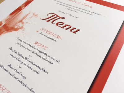
Celebration invite and menu
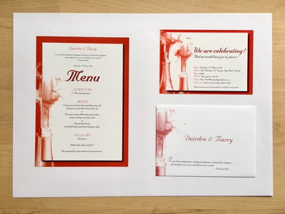
I was approached by a lovely couple to design their Wedding Anniversary invite and set menu to be hosted at Cibo Parnell. It was all about exploding champagne and fun times :)
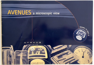
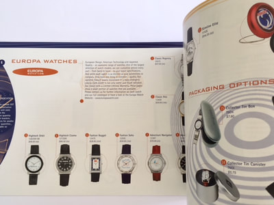
Avenue Publicity
Avenue Publicity was looking for a fun, slick design with lots of minimal white space for their brochure to showcase their latest range of accessories for promotional advertising concepts.
M.I.T - Manukau Institute of Technology
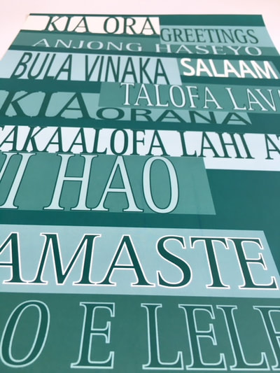
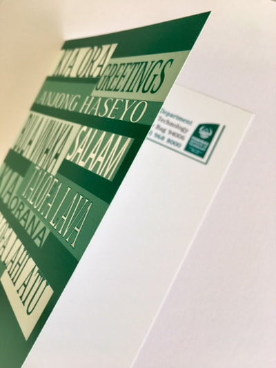
M.I.T wanted signage designed that would be placed around campus welcoming students and visitors.
We decided to incorporate the work 'Greetings' in all the languages that were present on campus at that time.
Later cards were printed following this idea as it had proved to be so successful.
We decided to incorporate the work 'Greetings' in all the languages that were present on campus at that time.
Later cards were printed following this idea as it had proved to be so successful.
Balmoral School - PTA Fundraising
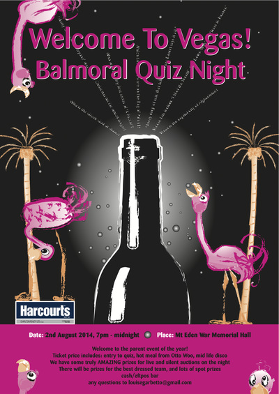
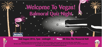
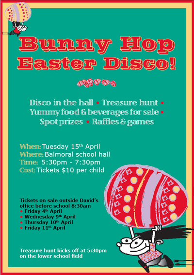
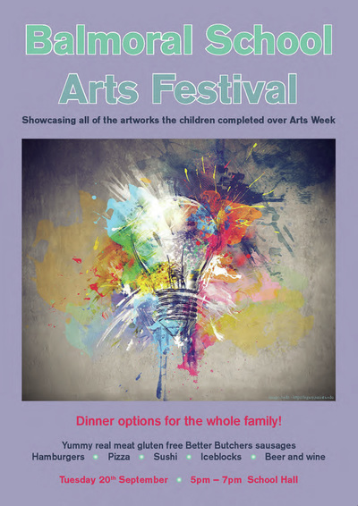
My children are both past and present at Balmoral School and it is always my pleasure to pitch in and help out where ever possible. My design skills have been used many times over the years for school fundraising events and social gatherings.
Enjo
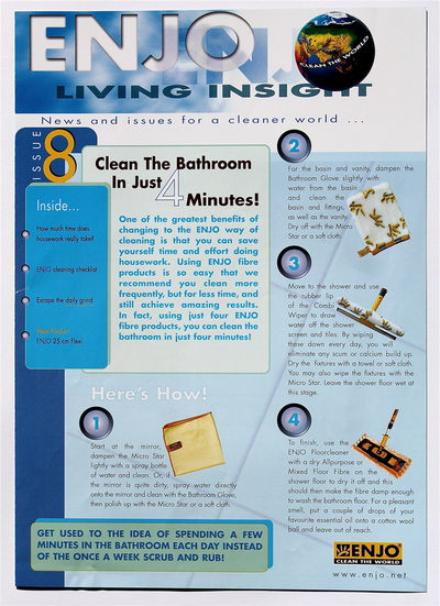
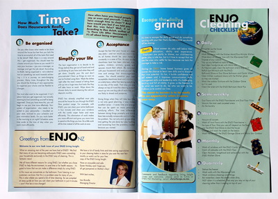
Enjoy wanted a brochure designed that would highlight their cleaning products in an eye-catching, informative way.
By working with a clean, fresh colour palette and interesting layout I was able to achieve a printed product they were very happy with as they felt it encompassed the Enjo ethos.
By working with a clean, fresh colour palette and interesting layout I was able to achieve a printed product they were very happy with as they felt it encompassed the Enjo ethos.
